From Comics To Swan Lake
Question: So what happens when a flat-broke comic book artist/illustrator and teacher is asked to create set designs for the ballet?
Answer: She does it.
Sounds easy, but the truth is when I got the call from Kim Tuttle at Pofahl Studios to create set designs for their upcoming production of the ballet "A Haunted Swan Lake," (to be performed at the The Philips Center here in Gainesville), I felt my heart leap… and for 2 reasons. Firstly, I needed the work: secondly, I had NO idea what I was doing! And I don't mean at the initial stage, I mean all through the project, at each step, I had to overcome over and over again, the reality that I had no idea what I was doing. I had never designed or painted sets. However, as a veteran creative professional, if I've learned anything it is that when I'm thrown into water over my head its better to learn to swim than to get out and shiver. I'd say I've learned to fake it, but the truth is, I've been at this a long time, and I've come to realize that all of these situations are just challenges, and challenges I've proven to be up to enough times that I never let on to the client that I feel in over my head. This chin-up confidence has yet to fail me.
For this special Halloween performance they needed to jazz up their set, make it different. My job was going to be turning their pre-existing castle backdrop into a haunted castle, and, of course, all this would have to be done on a budget and within the limits of ballet staging. This budget bit seems to be the challenge of the modern era, how to create something dramatic while getting the most bang for your buck. Actually, it's not easy, but having been a long time fan of pioneering exploitation filmmakers like Jean Rollin and Jess Franco, I have come to realize that financial limitations can often provide a framework within which real creative work can get done. It seems it's easy to get lost in a big budget.
First thing that happened was a meeting in which I got a look at the pre-existing backdrop that they had been using in "Robin Hood." It was a nice castle backdrop, and it provided a spiffy framework from which to create my designs. The next step was that Kim Tuttle took me to her warehouse and showed me where all her props, costumes, and so forth were stored… WOW… what a place! It was jam packed full of objects that had been created for past performances, rather like a dusty, dark and abandoned Wonderland. I took tons of pics of things that I thought I might be able to recycle. Plus, seeing her warehouse clued me in on what her expectations and potential limitations might be. When beginning a job like this any and all information is good. I learned in that warehouse what the limitations and possibilities might be.
She also showed me this tapestry she had bought to hang in the center of the castle backdrop, it was a cool skull, but the problem with it was that it was out of place, too modern, and I really didn't want to have to work around it, but initially I tried.
The first thing I did was scribble a quick sketch into my diary over lunch, just to get me past the intimidation and to get my juices flowing. At this stage I wasn't expecting any magic, nor for anything truly useful to happen other than my getting over the fear of the blank page. When starting on a journey like this I can get pretty overwhelmed, even intimidated to the point where the simple act of taking a first baby step is enough to get me past my fear and on to the act of creating.
It didn't amount to much, nor was it meant to.
As usual, before the real work began, I did plenty of research, assembling a pile of images of ruins and haunted castle stage props, old horror movies and so on. I could not possibly stress enough how crucial the research stage is. I had even gone so far as to research stage design.
After that I sat down in my studio at SAW to come up with 3 initial sketches in an attempt to work out what my concept for the stage design would be, trying to work in sometimes conflicting influences from old Universal Horror films, German Expresssionist films, and so forth, as well as influence from the research I had done. I have to admit one of my biggest sources of inspiration were the original "Imagineers" who designed all those marvelous rides at Disney, from the Haunted Mansion to the Pirates Of the Caribbean. The first of the sketches played off the idea that she wanted the setting to be decadent, so I went with a table covered opulently in food and candles, all set along the back. Oh… and they had a pre-exsting staircaise they wanted to use, so I used it with the idea that we would create a facade to cover it and make it look like the stone stairs of a castle, that was perhaps the only idea that survived my original sketches.
Oh… this sketch was probably most influenced by "Son Of Frankenstein."
My next attempt was essentially an effort to include that tapestry she had bought on-line, not so much that I wanted to use it, as that I wanted her to see that I respected her request that I try. Also notice that I was already thinking about using gargoyles of some kind… which was the seed of one of the more important ideas to come.
You will notice, that as is customary for me, I was using ballpoint pens and markers at this stage.
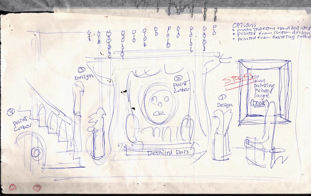
The third attempt seemed also to fall rather flat for me, but a key element, in many ways the focal point, had finally come to me, the ruined web-like fabric that would surround what I then thought would be the tapestry she had bought. Though the stairs were the first element to survive, that fabric framing the tapestry (which would soon change) was the pivotal element. But what she really got excited about was that I pitched that besides the show-stopping centerpiece (the skull and fabric), it would be flanked by a pair of gargoyle swans to symbolize both the white and black swans of Swan Lake, which you can see here in embryonic form.
Neither of us were thrilled with any of the above work, but the truth was, I hadn't intended her or I to be thrilled, I just wanted to get some concepts before her and get some feedback. Sometimes when I'm working with a client who has laid an extremely open-ended opportunity before me, or when I'm working on something I don't really know much about, I tend to start simple just to figure out where the client's head is at, and to figure out what I'm capable of. Often open-ended assignments aren't all that open-ended, they are often riddled with traps, and not knowing what the client is really looking for can be a problem. After this meeting I had figured out what was what and I came up with another sketch based upon the wisdom through our discussions over the prior 3 sketches.
The following sketch (directly above) is literally a tracing from the sketch above it. Now that I had the idea, I had needed to tighten the earlier sketch up into something clearly readable, hence the tracing. By the time I got to this sketch all the elements that were to be part of the final stage design are evident: a resolved focal point in the skull and fabric, the swan gargoyles, a cool fully realized design for the stairs (utilizing a coffin shape), and a couple elements we ultimately excluded. I had no intention of letting this be the final drawing, but when I told Kim, after her enthusiastic approval, that I was going to do a tighter drawing, she looked puzzled and asked what was wrong with this drawing?
Well… nothing, I guess.
As you may not be able to tell at this point, I had decided to opt out of using the storebought tapestry and pitched instead the concept that I would paint the skull backdrop myself (what was I thinking? I didn't know how to paint!) Add to this that I incorporated skeletal swans as the horns on the skull to tie it all together. I realized that concept (the swans) would carry the set design thematically around the focal point of the fabric-framed painting.
One other element I really liked in the above sketch were the chains. The painting and drapery would have to be hung with chain, and so I decided to work in hanging and drooping chains that would play off the drapery.
The next stage was creating a mock-up of the final centerpiece, the skull and fabric elements. This sketch was originally rather loose, as I had intended to redo a much tighter version of it, but since she had approved of the looseness of the set design sketch, I instead sat down with a red pen and marker and black felt tip pens and simply tightened up the sketch enough that it would suffice, and what happened was a sketch I rather like. This sketch was to become the guiding light for not only the painting, but the drapery.
You may notice that the sketch above looks rather abused, torn, stained and so forth. That is because it was there when I painted the final painting, and it was there when the drapery was being created. The sketch is like an old soldier who has seen a lot of action.
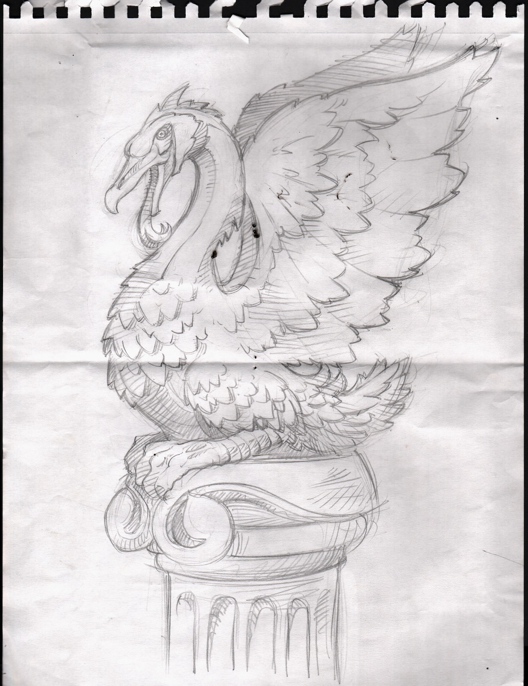
At this point I had also begun designing the newel post statuary as well as the swan gargoyles. I researched Rodin sculptures for the newel post, and went directly to the source for the swan gargoyles… Notre Dame cathedral. What I noticed there were that the gargoyles had very clean spacial sculptural lines that made them highly distinctive. The forms of the gargoyles at Notre Dame were deliciously stylized into a graphic abstraction that now seems almost ahead of its time.
Kim called in a sculptor, and he agreed to take on the swans, but decided he didn't have time for the newel post, so that element got canned, but our sculptor entusiastically got down to work on the swans. He loved the designs. The first I saw of the swans were the works in progress below, all sculpted by Paul Costanza.
Below are the nearly finished swans on their pedastals, the only thing missing is one of them had to be black, so below you will see the black one in all its finished glory. Needless to say I was thrilled with the outcome. He really captured the sketches I had turned in, and without misinterpreting a single thing. I've rarely ever turned my work over into the hands of another artist without being disappointed, Paul Costanza did not disappoint me at any turn.

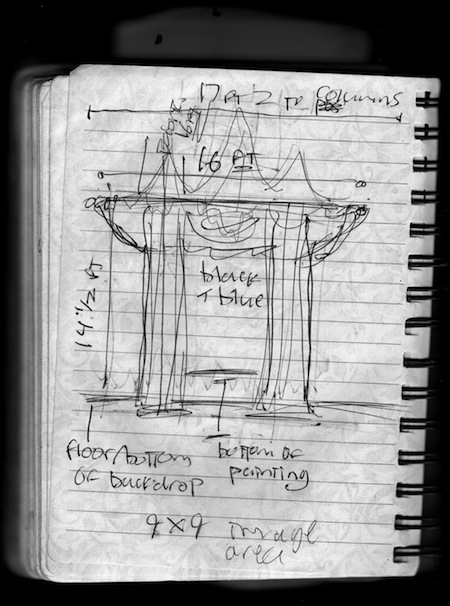
The next step was to work out the exact size and dimensions of the painting and drapery elements. Kim had me over to the studio where we laid the HUGE backdrop out in one of the rehearsal studios, and we began measuring and plotting. It seemed every time we took a measurement, Kim would shake her head and insist the painting and fabric be bigger… and biGGer… and BIGGER, which frankly scared me as I had no idea how to paint, let alone how to paint a huge expressive and powerful skull! Below are the series of sketches and notes I took regarding the measurements.
You'll also note in the sketch above that we had this problem of the backdrop showing in an awkward way over the top of the painting and drapery, so in the margins I began creating possible solutions to that problem, but in the end that problems seemed to have resolved itself.
At this point I had to call in some people. Firstly I needed a real painter to help me get going on the skull, and secondly I needed someone to create the tattered fabric element that was going to frame the painting. The first person I thought of was the very person who secured this job for me, fabulous local painter and person… Margaret Tolbert. Her work and the things she concerns herself with in her work could not possibly be further from the art world in which I inhabit, but I knew that what she did would mesh perfectly with what I could do in this situation. The fabric was another problem entirely, and in the end I turned to Tomis Aycock, a local artist and eccentric. I'd seen Tomis work on the most peculiar projects, and having seen the way he works (in a state of wholly immersed childlike wonder), I knew he would get the drapery right.
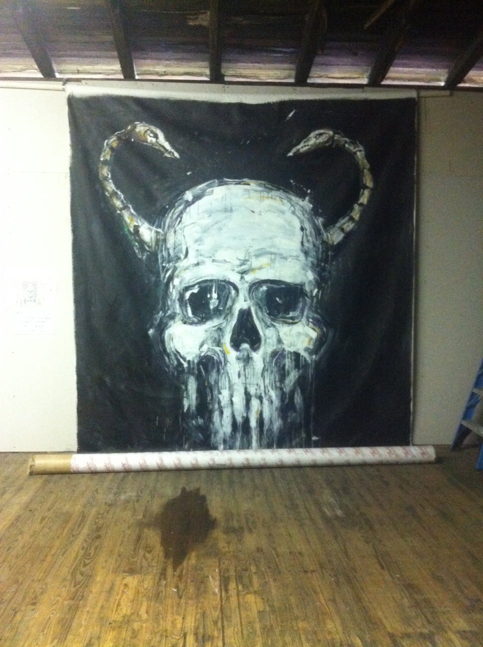
But before I turned all this over to Tomis, Margaret and I had to hang this monster 14 foot canvas (with a 10 foot image area) in the industrial building SAW is connected to. To tell the truth, as we stood poised to paint that thing, staring at the *B*L*A*N*K* canvas I began to have a bit of a panic attack. I think the first thing I said, standing there brush in hand, was "I have no idea what I'm doing…"
Margaret was a rock. She was not at all concerned about it, and never got impatient with me no matter how freaked out I got. Just trying to draw the basic form of that skull on something so damn huge was an ordeal. No matter what I did, every time I stood back and looked at it, the form was eluding me, it looked wonky as hell on all fronts. I was practically in tears as I tried to torture the form out of that blank canvas, and if it weren't for Margaret, to tell the truth, I may have had a breakdown. She was more than a pro, more like my painting guru. She just maintained her confidence in not only herself but me. She gave me pointers, and finally, I'm almost ashamed to admit it, I almost pushed her out of the way once I had it. All at once, like a miracle, I could see the form, I could see the skull, I went at it frantically, saying, "I can see it… I can see it!" and soon it was all there. Funnily, I had hurt my foot in all this wild enthusiasm, having jumped a little too hard off the ladder, being barefoot, I had also managed a splinter or two, and by the time I got home my big toe was all bruised. Proud battle scars… well, no scars, but still.
But form was only the half of it, I now had to learn to paint expressively, wildly, had to use long brushes and go at it. Margaret did get frustrated with the way I was using the brush, and finally said to me, "Say something!" Meaning… the marks I was making were timid and terrified, and she wanted me to let loose and move some serious paint around. Soon, what had become terrifying became brilliant fun, and we nailed that painting in several hours, from blank canvas to finish in one early evening. Thank you Margaret!
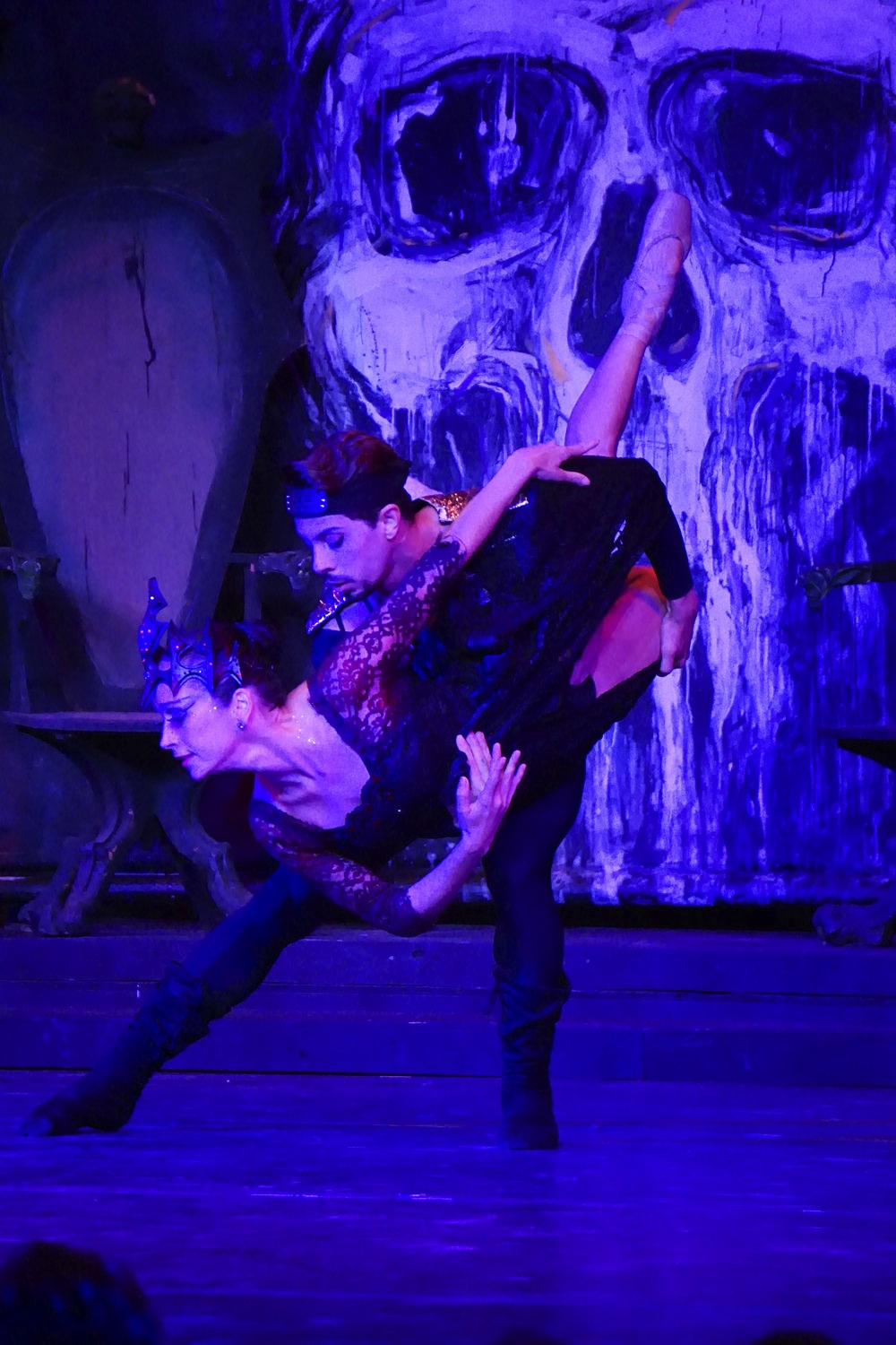
While it's a bit of a spoiler, the above pic doesn't really do justice to the 10 foot painting, so below is an image of how it looked on stage in Ocala. Magic...
Quite an impact. Now, with that underway, I got Tomis going on the fabric, showing him what I was after in my research. I showed him ruins and old drapes, and set him to work figuring it out. I tend to be a control freak about my work, but in this case I knew that I was in over my head with this fabric and that it would be best to let Tomis figure out how to torture and tatter the fabric. To my surprise, in the end, he used a torch to burn the fabric… it looked amazing… so decadent and ruinous.
Meanwhile Kim had a carpenter working away on the facade for the stairs (which I would have to paint to look like stone). At this point I began to realize what an undertaking this was, and just how much I was overseeing. It blew my mind to be in such a position where so many HUGE things were coming to life based upon my rather humble sketches. To tell the truth, it was about as close to being a "grown up" as I have ever felt. I've never had a team of people working on my seeing my vision through to reality, a carpenter, a painter, a sculptor, and Tomis on the fabric.
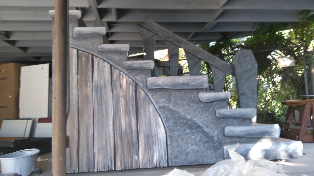
Time was wasting and the performance dates were drawing close. We had 2 shows, one in Ocala, and one here in Gainesville at the beatuiful Philips Center. I still had one last element that I had to tackle, the painting of the facade on the stairs. I decided to call in a SAW student to help me, Javed, and yes… I paid him. As we stood in front of those steps with our sponges and paint I must have said a half dozen times, "I have no idea what I'm doing." It was difficult to instruct Javed until I knew what I was doing. Fortunately I had seen the backdrop, so I knew a pointilistic sponge texture would do. About a half hour into it, it started to take shape and Javed said "I thought you didn't know what you were doing?" As I said at the beginning, I've been at this a while, and most things are within my reach, which is why I have been so readily taking on jobs I've never done before.
Ah… that day I did make the one big mistake all artists dread. We had beverages in cups, and had filled a mop bucket full of water for the paint brushes. So feverish into the process was I that I lost track of my water cup and took a big drink out of our dirty mop-bucket paint-water! I knew what I had done right away and did a spit-take worthy of Lucille Ball, Javed laughing away in the background. In the end I not only showed Javed how to paint stairs to look like stone for a set, but how to change a tire… my car had a flat when we went to leave, and being an old-fashioned girl, like hell if I was going to change that tire with a man around.
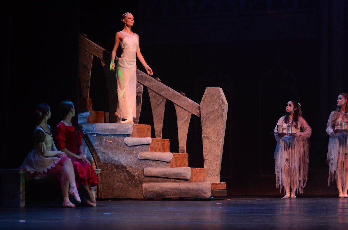
As a final note on this, one element about the stairs that upset me was that the wooden dungeon door we'd had crafted did not show from the audience. That was brilliant. I had Javed paint the slats of the door black, then I went over them with a paint-gobbed brush and drew lines in the wet paint to pull out the wood grain, revealing the black underneath.
Javed took a couple pics of the stairs, one before, and one after:
And one image of the stairs on stage (see what I mean about the wooden door being hidden?) Notice also the scar on the stair where some stagehand had scraped the hell out of it.
Finally the big night was upon us, and Javed and I cleaned ourselves up and went to the Ballet. I have to admit, as I entered the hall I was pretty impressed with myself for being part of it. We sat in the third row with nothing between me and my work… all of our work, but a curtain, and I could not wait for it to part so I could finally see it all together.
Oh… I opened the program to see how I was credited… they had misspelled my name. Shrug.
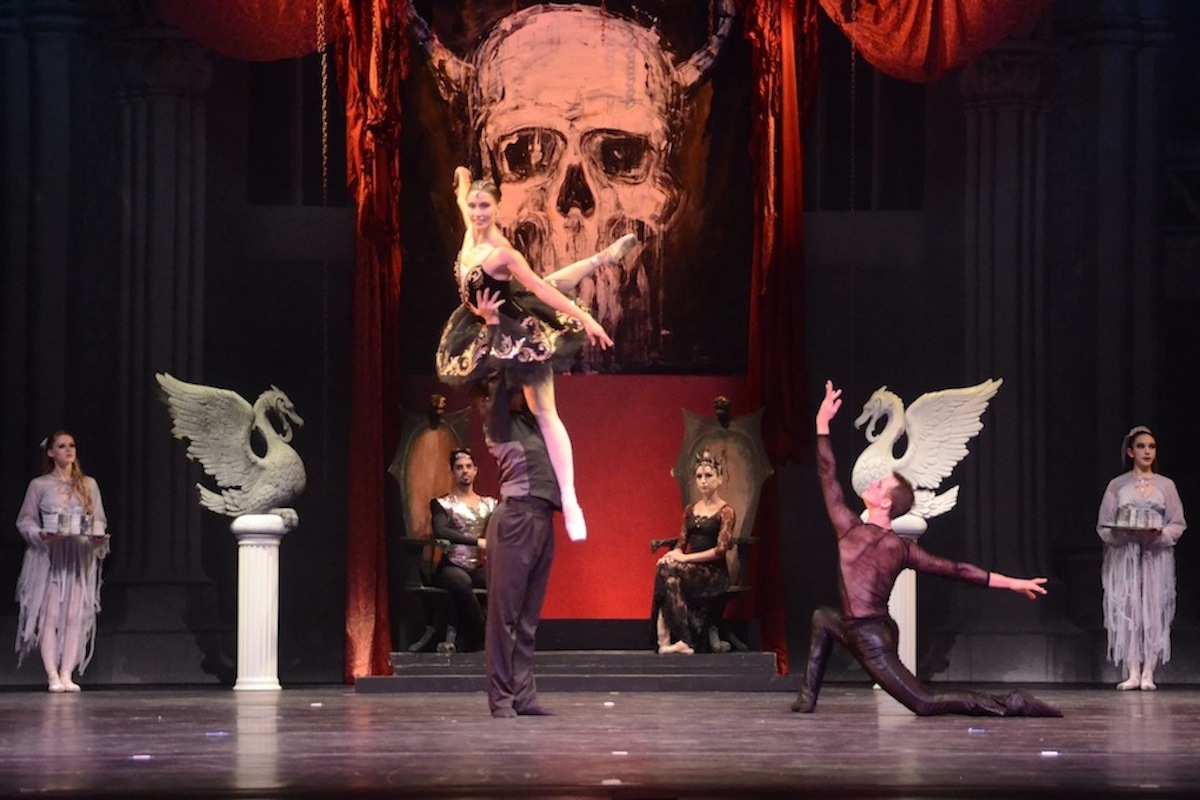
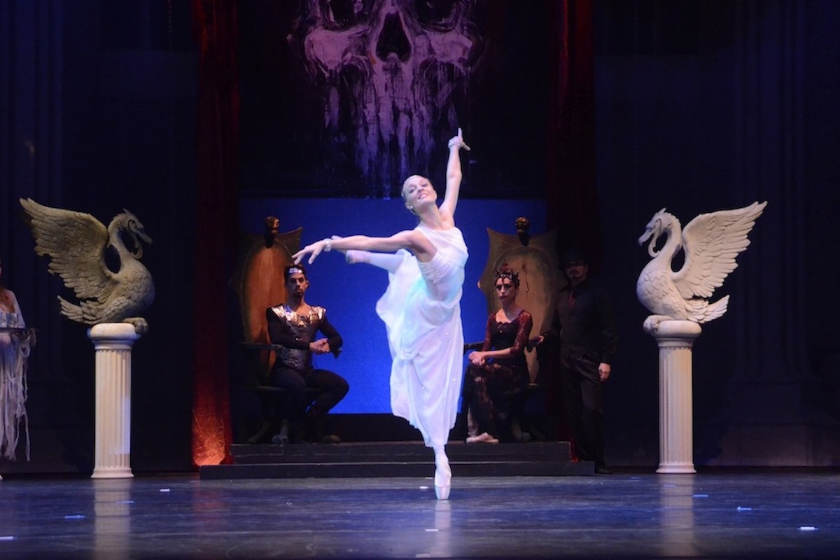
When the curtains parted, there it was, my stage design, bathed in light and color and music, and my jaw dropped. It was beautiful, impressive, dark, everything I had hoped it would be, and I leaned into Javed and said: "I did this!" The lighting really brought it all to life, and the few alterations Kim had to make to satisfy the staging situations were perfect (for example, more drapery was added, and the painting was raised higher than expected… note how hard the super cool chains are to see). Mostly what impressed me was what a great tone and atmosphere the design and lighting had created, and how well it sunk into the music.
TO SEE THEM IN THEIR FULL-SIZE GLORY… CLICK TO ENLARGE...
As stunned as I was by the site of it all on stage, it wasn't until the ballet started that I really got it. I was a cog in a magnificent wheel, classical music, classically trained dancers, a gorgeous hall full of people, and my humble sketches brought to life to house it all. A lot of work for a few brief moments in the spotlight.
I leaned into Javed and said, "You know… it only took me 5 hours to do the design work."
When the curtains closed on the first act I was rather stunned how transient it all seemed. Here I was, a career illustrator, used to seeing my work in print for years to come, and now… it was gone, just a memory.
But it was all worth it, and I realized that just like the dancers, I had to walk away and start the next project.
And so I have.
(Check out Justine's site at barefootjustine.com for more like this.)
