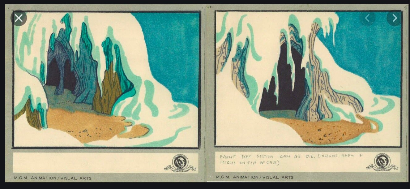
Cartooning Detailed Caves Of Wonder!
Thoughts and words below from Justine Andersen, SAW’s Instructor for our Depth and Details Online Course as well as our Year-Long Intensive Program!
Justine Andersen:
“So in an attempt to tone down the anxiety level regards the more advanced level of this class, let's look at a few more "cartoony" examples of "caves of wonder," and let's start with one of the very BEST! Maurice Noble's backgrounds for Ali Baba Bunny.
THAT is how it's done! groupings, layers, lovely lines and curves, note the spaces between objects (great negative shapes that allow the details to pop) and so much more.
Not only is the pose of Daffy great above, but note not only the lovely curve of the floor line and how that curves around behind him, note also the abstracted textures of the cave walls, and the very subtle depth cues to the right of the frame.
I believe above you are looking at a Maurice Noble design for the cave of the Grinch... notice the 2 great options, and the fantastic forms! Note how his use of curving drooping forms give the walls and snow so much weight.
Now... let's take a look at some examples from Disney's Aladdin.
Note the use of light negative space in the foreground, middle red in the middle ground, and dark shapes in the background. See also the less detailed piles in the middle ground and the 2 piles in the foreground, using the coins to create a pattern that allows the treasures to show!
As I said above... see above.
Now, let's turn our eyes to one of my favorite animated movies, the Rankin Bass Hobbit.
Note the use of minimal details around Smaug so the textures of the dragon show, and backing up my teaching about "groupings," see the groupings of treasure objects in the foreground helping lead our eyes to Bilbo!
Now, let's enter another cave of wonders, one of a very different sort...
I have always adored the Arthur Rackham level of details in this film. Here we see not only the deliciously delineated outer surfaces, but the insides of the cave through the door and window, and both the exterior and interior show us what a careful, neat, clean Hobbit of good taste old Bilbo was from the flowers to the great stuff inside. Details should tell us something about the character(s) and scene, they should not just be visual pollution). Also note how little detail there is in the grass above so the eye does not get lost up there, and that lovely large negative shape in the foreground. Everything in this drawing, every detail, shows you who Bilbo is... ditto below...
...So let's not forget the lovely cave of wonders that was the interior of Bilbo's home. Ah, what a great place to rest and wonder... and see how grouped the details and objects are so our eyes too can rest on the negative shapes in between.”
Want to learn more about achieving depth and details in your comics?
Check out Justine Andersen’s Depth and Details Online Course as well as our Year-Long Intensive Program!
Want more courses by Justine Andersen and other SAW instructors?
See our variety of Online Courses or SAW’s Year-Long Intensive Program!
And always feel free to come say “hello” and see what we’re all up to on SAW's Mighty Network!
Cheers.


